Image comparison – what is the difference?
Prize: £100 photography voucher. Please answer the below 3 questions:
• Which image do you like the most out of the 4 images (not if you like them or not!!!)
• What is the different in between the 4 images below? (please take in consideration all technical aspects and composition and be as thorough / precise as you can)
• Why do you like that image the most? (be as detailed as you can)
Please post your comments in the comments area at the bottom of this blog post, DO NOT post the comments on the facebook post.
Please DO NOT make comments regarding the aesthetics of these images, these images were created on purpose using a banal subject to enable the viewer to be objective and impartial in assessing them.
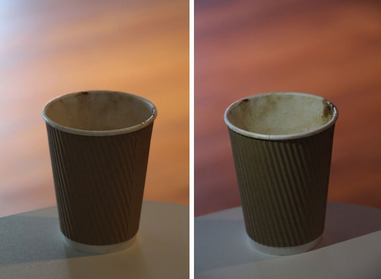
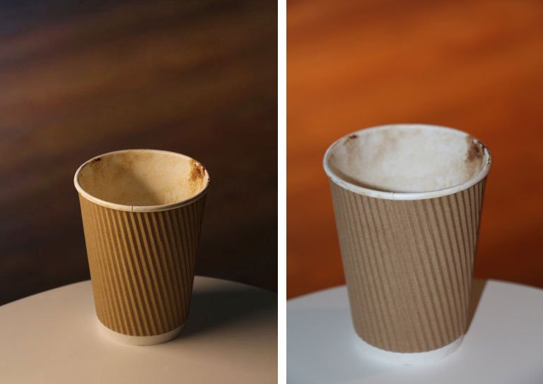

I like the 3rd image, or 1st image in the second row if you like, as it has soft light which allows the brown colours of the coffee remains, the background and the cup to stand out. It is the only proper 3D image with a nice balance on the DOF. Also the combination of brown shades blends perfectly and there are no harsh lights to kill shades or the interest of the image.
Differences, the off the camera lights are placed differently in all of them and the position of which the image is taken also differs. Analytically starting with the last image, is straight on (probably on the camera), full on power and blows out all the shadows, therefore we can see some behind the cup. Also the background is lighted up with the speedlite and it makes very distracting to the eye, the interest for the cup goes away. 1st image, the lights are behind the image and there are only shadows on the front of the cup which loses the interesting lines and pattern of it as it becomes hard to see it. Second image, lights are on the side, the cup have some light, but again most of the front part is not getting an equal distribution of the light and the inside of the cup has barely any light to it. Third image, the one I like, has a light (not very strong) on probably 45 degrees above it and on the left, probably 80-105mm zoom which allows specific lighting on the cup, nice shadows, and a good percentage of the cup side and front to be bright and clear to the eye. The background is nicely faded out and softly blended with the image with distractions. The inside of the cup also has some soft light, allowing one to understand that there was coffee… A Flat White
Well done Alki, really good assessment!
Thank you :)