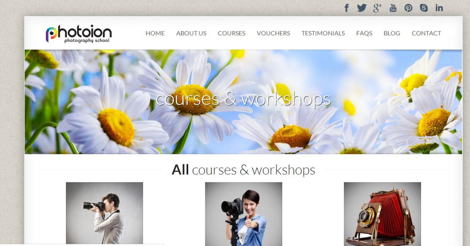
For those who read our blog as and when we post, you may notice that our website has recently undergone a transformation to a new shiny version that is absolutely jam packed with all the information about our school.
As a photography school, ensuring all our imagery was clean and crisp was a very important to us in order to show website visitors just how seriously we take our school; we don’t settle for anything less than the best.
The navigation on the site is extremely easy, with everything laid out in one tab at the very top of the page, that remains uniform as you browse, allowing you to simply click through each page and work your way around.
We have covered everything from courses to testimonials, FAQs to testimonials and have considered your ease of access during every step of developing the new site
By ensuring the new site is immaculate, we aim to inspire people to hop on board with Photoion photography school and get involved in one of our courses. With 18 to choose from, there is bound to be one to suit exactly what you are looking for from our photography courses.
Our site is very new and customer feedback is extremely important to us; you are what makes our school special. Do you think there is something lacking from our new website? Or have we completely missed something? We welcome your suggestions and take everything on board to help us grow and evolve everyday, just drop us a line with your feedback!
Everybody who tells us their opinion of our website will be entered into a prize draw to win a £100 voucher, redeemable against any course at Photoion Photography School.
Please comment underneath this blog with your full name and email address in order to enter.


Hey guys, great website very impressive. I like the new look and navigation is a doddle.
The Schedules bit on the home page doesn’t load well on my iPhone – It cuts off the ‘book now’ button. Otherwise, looks pretty cool :)
Good looking website
thank you for your comments Naveed, we are aware of the schedule on the mobile and our website developer is trying to fix that.
thanks Eric
Hello,
Congrats for the new website! It kooks good and it’s quite easy to browse through. Looking at the portfolios of former students, when clicking on the pictures there takes you to a max image page with no links; I guess it’d be an idea to disallow this action when hovering over those pictures. Bests! Ioana
Looks good! Clean and simple always is better!
I really like the new clean layout – easy to navigate and find what you’re looking for!
thank you all for all your comments, really much appreciated